

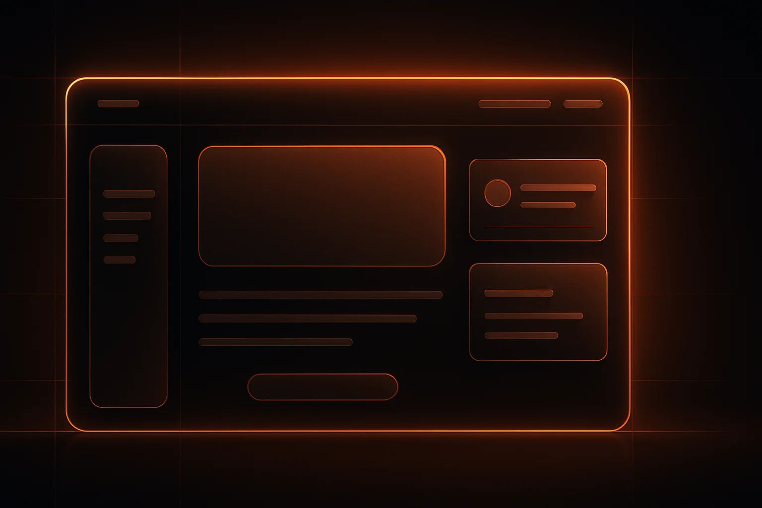
Many small business owners invest in digital ads or SEO, only to find that visitors leave their site without taking action. Often, the problem isn’t the traffic, it’s the landing page. A cluttered, outdated, or confusing landing page can turn away potential customers in seconds. First impressions matter, and for most businesses, the landing page is where that impression is made.
Why Landing Pages Matter for Small Businesses
Landing pages are designed for one purpose: to guide visitors toward a specific action, whether that’s filling out a contact form, booking a service, or making a purchase. Unlike a homepage, a landing page should have a single, focused goal. Small businesses with limited budgets and resources need every visitor to count, so a well-designed landing page can make a significant difference in conversion rates.
Key Elements of Modern Landing Page Design
Modern landing page design isn’t about flashy graphics or trendy effects. It’s about clarity, usability, and trust. Here are the most important elements to consider:
- Clear Value Proposition: Visitors should immediately understand what you offer and why it matters to them. Use a concise headline and subheadline that address the visitor’s need or problem.
- Focused Call to Action (CTA): Every landing page needs a prominent CTA, such as “Book a Consultation” or “Get a Free Quote”, that stands out visually and tells the visitor exactly what to do next.
- Minimal Navigation: Too many links can distract visitors from the main goal. Keep navigation simple or remove it entirely from landing pages intended for conversions.
- Trust Signals: Add testimonials, reviews, client logos, or security badges to build credibility. Social proof helps visitors feel confident about taking the next step.
- Responsive Design: Your landing page must work smoothly on smartphones, tablets, and desktops. A mobile-friendly layout is non-negotiable for modern users.
- Fast Load Times: Slow pages lose visitors. Compress images, use efficient code, and avoid bulky animations.
- Visual Hierarchy: Arrange content so the most important information stands out. Use headings, bullet points, and contrasting colors to guide the eye.
Common Landing Page Mistakes to Avoid
Even with the right intentions, small businesses often make mistakes that hurt conversions. Watch out for these issues:
- Too Much Text: Long paragraphs can overwhelm visitors. Break up information with short sentences, bullet points, and whitespace.
- Unclear CTA: If visitors aren’t sure what to do, they’ll leave. Make your CTA button obvious and action-oriented.
- Generic Stock Images: Overused or irrelevant images can reduce trust. Use custom graphics or authentic photos where possible.
- Ignoring Mobile Users: Failing to test on different devices can drive away a large portion of your audience.
- Slow Performance: Large images, unoptimized code, or too many scripts can slow down your page and hurt your rankings.
- Multiple Goals: Trying to promote several offers or services on one landing page can confuse visitors. Stick to one main objective per page.
Website Conversion Optimization: Practical Steps
Improving conversions isn’t about luck. It’s about making deliberate choices throughout your landing page design. Here’s a step-by-step approach:
- Define the Goal: Decide what action you want visitors to take. Every design choice should support this goal.
- Map the User Journey: Consider how visitors arrive on your landing page and what information they need to feel comfortable taking action.
- Write Compelling Copy: Use language that speaks directly to your target audience. Address their pain points and explain the benefits of your offer.
- Design for Scannability: Most visitors skim. Use headings, bold text, and short sections to make your content easy to scan.
- Test on All Devices: Preview your landing page on smartphones, tablets, and desktops. Fix any layout or usability issues.
- Track and Adjust: Use analytics to see where visitors drop off. Experiment with different headlines, CTAs, and layouts to improve results.
Modern Layouts: What Works for Small Business Landing Pages?
Small businesses don’t need complex designs to succeed. Instead, focus on layouts that support your message and guide visitors toward your CTA. Here are a few layout ideas that work well:
- Single-Column Layout: Keeps the user focused and works well on mobile. Place your headline, supporting text, CTA button, and trust signals in a linear flow.
- Hero Section with Visual: Use a bold image or graphic at the top, paired with a headline and CTA. This grabs attention right away.
- Benefit Blocks: Highlight key benefits or features in a row of icons or cards. This helps visitors quickly understand what you offer.
- Social Proof Section: Display testimonials, reviews, or client logos near your CTA to reinforce trust.
- FAQ Section: Address common questions or objections directly on the landing page to reduce hesitation.
User Experience (UX) Principles for Landing Pages
Good UX is about removing friction and making it easy for visitors to take action. For small business landing pages, consider these UX principles:
- Consistent Branding: Use your brand colors, fonts, and style throughout the page for a cohesive look.
- Accessible Design: Make sure text is readable, buttons are easy to tap, and forms are simple to fill out.
- Logical Flow: Guide visitors from headline to CTA in a logical order. Avoid surprising users with popups or unexpected content.
- Microinteractions: Subtle animations or feedback (like a button changing color when hovered) can make the page feel more interactive without being distracting.
Responsive Design: Why Mobile Matters
Over half of web traffic comes from mobile devices. If your landing page isn’t responsive, you risk losing valuable leads. Responsive design means your page adapts to any screen size, keeping text readable, buttons accessible, and images clear. Test your landing page on multiple devices and browsers to catch issues before your users do.
Redesigning Your Landing Page: When and How?
If your landing page isn’t converting, it may be time for a redesign. Signs you need a change include high bounce rates, poor engagement, or feedback about confusing layouts. Approach redesigns with clear goals:
- Start with analytics to identify problem areas.
- Survey customers or ask for feedback on what’s missing or unclear.
- Update visuals, copy, and structure based on current landing page best practices.
- Test changes in stages to see what works before rolling out a full redesign.
Redesign projects can be handled in-house or with professional help. For complex needs or when time is limited, partnering with a web design agency can save resources and deliver a stronger result. See how professional web design services can improve your landing page.
Checklist: Auditing Your Landing Page
- Does the headline clearly state your offer?
- Is the main CTA above the fold and easy to spot?
- Are trust signals (testimonials, reviews, badges) visible?
- Is navigation limited to keep users focused?
- Does the page load quickly on all devices?
- Is the page layout clean and uncluttered?
- Are forms short and easy to complete?
- Is the design consistent with your brand?
- Have you tested the page on multiple browsers and devices?
- Is analytics set up to track conversions?
Making Smart Decisions: DIY vs. Professional Landing Page Design
Some small businesses use DIY website builders, while others invest in custom web design. If you have a simple offer and a tight budget, a well-chosen template can work, but it’s easy to fall into traps like generic layouts or missing mobile optimization. For businesses that rely on their website for leads or sales, professional design can pay off by reducing friction, building trust, and increasing conversions. Weigh your options based on your goals, timeline, and available skills.
First impressions are made in seconds. If you want your landing page to work harder for your business, consider a redesign or professional review. For guidance on creating layouts that drive results, WebVerse Solution can help you plan and build a landing page that supports your goals.
FAQs
What makes a landing page modern?
A modern landing page uses clean layouts, strong visual hierarchy, responsive design, and clear calls to action. It avoids clutter and focuses on guiding visitors toward a single goal.
How do I know if my landing page is effective?
Check your analytics for conversion rates, bounce rates, and user engagement. If visitors aren’t taking the desired action, review your copy, layout, and mobile usability for potential issues.
Should I use a template or custom design for my landing page?
Templates can work for simple needs, but custom design offers more flexibility and can better reflect your brand. Choose based on your goals, resources, and the importance of conversions.
How often should I update or redesign my landing page?
Update your landing page whenever you notice declining conversions, receive feedback about usability issues, or your business offer changes. Regular reviews help keep your page effective.